• Home
  • About
    • About Me
    • Capabilities
    • Projects
    • Photography
    • Videography
  • Projects
    • Branding / Package Design
      • Brand Identity
      • Brand Licensing
      • Graphic Design
      • Packaging Design
      • Campaigns
      Web /NFTs / Digital Media
      • Social Media Content
      • NFTs
      • Web Design
      • Event Collateral
      • Making of
      CGI / Photo / Video
      • Photography
      • Videography
      • CGI Builds
      • AI Projects
      • Animation
      Portfolios
      • Advertising Reel
      • Behance
      • Showcase Portfolio
      • Advertising Pitches
      • Blog
  • Blog
  • Blog
  • Tech
    • Artificial Intelligence
    • NFT OpenSea Collections
  • Contact
  • Home
  • About
    • About Me
    • Capabilities
    • Projects
    • Photography
    • Videography
  • Projects
    • Branding / Package Design
      • Brand Identity
      • Brand Licensing
      • Graphic Design
      • Packaging Design
      • Campaigns
    • Web /NFTs / Digital Media
      • Social Media Content
      • NFTs
      • Web Design
      • Event Collateral
      • Making of
    • CGI / Photo / Video
      • Photography
      • Videography
      • CGI Builds
      • AI Projects
      • Animation
    • Portfolios
      • Advertising Reel
      • Behance
      • Showcase Portfolio
      • Advertising Pitches
      • Blog
  • Blog
  • Blog
  • Tech
    • Artificial Intelligence
    • NFT OpenSea Collections
  • Contact
  • Facebook
  • Instagram
  • Pinterest
  • YouTube
  • Tumblr
  • LinkedIn
  • Flickr

Welcome to Blog

Florida Lumber. Door Sweet Home. Print

Date:  December 14, 2016
Author:  admin
Category:  Uncategorized
Comments:  0
Florida Lumber. Door Sweet Home. Print
Details: 
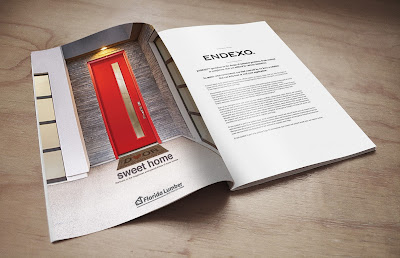
“Door sweet home”, This tagline was inspired by the phrase “home sweet home” where we use the word “door” to relate our product. The fundamental idea was to remember the feeling when we go outside of a home, and we return to rest at our “sweet home.”

Credits:
Agency: GMG Advertising
Advertiser: Florida Lumber
Category: Print
Entry Type: Magazine
Account Executive: Erica Martin
Concept Art Director: Marco Zuniga
CEO: Mike Beovides
Graphic Designer: Marco Zuniga
Copywriter: Marco Zuniga / Erica Martin
Photography: Florida Lumber
Strapline: Door sweet home. Partners in the happiness and peacefulness of many homes


Read More

BCAA supplements. Perfect performance and recovery enhancer

Date:  December 8, 2016
Author:  admin
Category:  Uncategorized
Comments:  0
BCAA supplements. Perfect performance and recovery enhancer
Introduction:
A creatine and beta-alanine free amino acid supplement CHARGED+ UP to help increase your energy, maximize your workout performance, and enhance recovery.

Details:
Details: The goal of this ad proposal was to promote different brand’s flavors such as watermelon, blue Raz, and lemonade. I used the cloud of smoke by using different colors to identify and enhance the flavor.

Credits:
Advertiser: PMD Professional Muscular Development
Product: BCAA supplement
Product line extensions: Blue Raz flavor, Lemonade flavor, and Watermelon flavor
Tagline: Performance + Recovery
Copy: Perfect performance and recovery enhancer
Art Director: Marco Zuniga
Graphic Designer and Retoucher: Marco Zuniga

Thinking

Read More

Florida Lumber. Cover design

Date:  November 28, 2016
Author:  admin
Category:  Uncategorized
Comments:  0
Florida Lumber. Cover design
A surreal scene created in Adobe Photoshop as you can see my digital technique here,  where I developed an analogy, replacing Christmas lights with lumber doors.

Details:
On this image, the client needed to communicate the doors variety and to send a greeting for Christmas to their customers. With the power of design and strong concept, we produce a picture, mixing imagery of doors for creating a Christmas tree. Is important to mention our client is a leading supplier of lumber, doors, paint and building materials. Please look at the post-production elements below.

Introduction:
Florida Lumber is the leader in providing quality building materials, lumber, steel, doors, hardware, and paints in the South Florida region.
Theme: Christmas
Category: Print
Entry Type: Magazine
Tagline: From our store to your home

Credits:
Agency: GMG Advertising
Advertiser: Florida Lumber
Topic: Christmas Day
Category: Print
Entry Type: Magazine
Account Executive: Erica Martin
Concept Art Director: Marco Zuniga
Graphic Designer: Marco Zuniga
Copywriter: Mike Beovides
Photography: Florida Lumber / Shutterstock


Photoshop Manipulation Tutorial Christmas Ad

Textures: zoom in

Final artwork

Elements: Shutterstock images

Thinking

Final Artwork

Read More

A+ MiniStorage. You enjoy it, we store it. Billboard

Date:  November 18, 2016
Author:  admin
Category:  Uncategorized
Comments:  0
A+ MiniStorage. You enjoy it, we store it. Billboard
Details:
For these pieces, the idea of this campaign is to emphasize the spaces for anything you have, no matter the size such as the items you see in these images (a yacht, a motorcycle or an RVs). At the end of the day, what matters is that you are relax and enjoying your day or your vacation since A+ MiniStorage will help you store it.

Credits:
Agency: GMG Advertising
Advertiser: A+ MiniStorage
Category: Billboard
CEO: Mike Beovides
Senior Executive Manager: Jennifer Rangel
Concept Art Director: Marco Zuniga
Art Director: Marco Zuniga
Copywriter: Marco Zuniga / Mike Beovides
Graphic Designer: Marco Zuniga
Photography: Shutterstock

Selling the big idea

Table of contents:

• Current understanding
• Value, attitudes & lifestyle
• Target audience
• The problem
• Insight
• The challenge
• Brand support
• The Solution: Connection
• Big idea!
• Unique selling proposition
• Execution


Current understanding


We live in a world where buying whatever we desire adds enjoyment to our lives. This need of purchasing to enjoy leaves us with a big problem. Each time we buy something new we are left with less and less space to store these items we enjoy and wondering what to do.
“Where do we store all these items we enjoy so much?”

_________________________________________________________________________

The concept behind our design places value on your items and making sure that just because you don’t have room for it doesn’t mean you have to get rid of it. Memories and time spent with these items can be safely stored and taken out later without cluttering your home.  
_________________________________________________________________________

Value, attitudes & lifestyle

Buy everything you want…

Target audience

… and enjoy everything that you buy

The problem

But then, you don’t know where to store it
Insight

“I never have space for anything”.

The challenge

The challenge is to demonstrate that  A+ Mini Storage has that space you’re looking for.

Brand support

At A+ MiniStorage we have the space you are looking for to store the items you value so much

The Solution: Connection

The most important thing to remember is to enjoy because A+ Mini Storage will be in charge of the rest

Unique selling proposition
_______________________________________________________________________________

The door seen above the billboard serves as an analogy to buy the space you need offering by A+ Mini Storage. Within the graphic, we aim to place text detailing the dimensions of storage and number of parking spaces available for RVs and boats.
_______________________________________________________________________________

Execution: 360° campaign

Print Ads


Billboards

Artworks
Exciting news about billboard A+ MiniStorage from NBC

Digital technique: YouTube channel

My workstation

Storytelling (Spanish version)
La idea esta enfocada en la experiencia de disfrutar lo que compramos y lo que pasa después cuando no sabemos donde guardarlo.

Este insight es muy importante porque cuando compramos no pensamos en donde guardaremos nuestra compra.

Pensamos en los buenos momentos que pasaremos con lo que tenemos.
Aquí esta el problema…  después no sabemos donde guardarlo cuando tenemos poco espacio.

En el Billboard vemos la solución a ese problema pero de una forma positiva metiendo las experiencias que vivimos dentro de un almacén.
Tagline:
“Tu te diviertes, nosotros lo guardamos”

You enjoy it, We Store it. ( Tagline approved)
Fun! We Store Everything (Original tagline)
Thank you!
Read More

Florida Lumber. Social Content – Happy Halloween

Date:  October 31, 2016
Author:  admin
Category:  Uncategorized
Comments:  0
Florida Lumber. Social Content – Happy Halloween
Credits:
Agency: GMG Advertising
Advertiser: Florida Lumber
Theme: Halloween
CEO: Mike Beovides
Account Executive: Erica Martin
Art Director: Marco Zuniga
Graphic Designer: Marco Zuniga
Photography: Florida Lumber

Introduction:
Florida Lumber is the leader in providing quality building materials, lumber, steel, doors, hardware, and paints in the South Florida region. They are “more than just lumber.”


Thinking:

Elements:


My workstation:

Read More

Amadeus North America. Presentation Design

Date:  October 18, 2016
Author:  admin
Category:  Uncategorized
Comments:  0
Amadeus North America. Presentation Design
I designed deliverables, such as information visualization including images, icons, assets, typography hierarchy, and colors following Amadeus brand identity to promote technology, leisure travel solutions, and web booking engine for Amadeus North America company.
Introduction:
Amadeus provides products and services to sell travel, enhance the traveler experience and build customer engagement. Amadeus travel technology helps you to manage your own travel business, reducing costs and improving revenues.

Credits:
Agency: GMG Advertising
Advertiser: Amadeus North America
Entry Type: PPT Presentations
CEO: Mike Beovides
Account Executive: Erica Martin
Art Director: Marco Zuniga
Graphic Designer: Marco Zuniga
Copywriter: Amadeus
Photography: Shutter Stock & Amadeus
Shutter Stock Photos

Project: PPT Presentations
Title: Powering Business Travel

“Our brains process images 60,000 times faster than text”

Workstation

Read More

Guide to building a Brand Guidelines

Date:  September 12, 2016
Author:  admin
Category:  Uncategorized
Comments:  0
Guide to building a Brand Guidelines
The rapid development of online technologies and innovations produced a revolution in the field of small businesses. Manufacturers, freelancers, entrepreneurs, retailers, professional creatives of all kinds now can experience an unprecedented freedom as small biz owners. 
They can create a website and build an online presence, find niche markets to grow into and discover new opportunities for monetization. But can they establish themselves as “brands,” like big companies have been doing for decades?

One key outcome of the online revolution for businesses is the democratization of branding. It is no longer solely the benefit of the “big fish” who can easily devote hefty chunks of the budget to brand building. Now more than ever, companies and organizations across industries and on different scales can accomplish a great deal through brand development.

This detailed article on how to build a brand online is recommended for all small business owners and self-employed professionals who want to see their business fulfill its potential. It is your first step towards establishing your business as a professional brand.

1. Your Brand Identity

To build your brand name successfully you first need to know it inside out. You start by defining the core values and qualities of your brand and let them guide every step in the brand development strategy that we will discuss throughout the article.
Consider the following elements that make up your brand identity:

Who Is Your Target Audience? 
Every business transaction is a dialog. If you want the conversation to go well you need to listen to your partner and understand them. Your target audience is the primary conversation partner of your business. The more you know about your audience, the better you become at talking with them.

Here are some questions you want to answer:

• Demographics: Your audience’s age group, gender(s), educational profile, location.

• What do they do with their time?

• What drives them?

• What are some of their favorite brands? Or cultural icons?

• What do they like to do online?

• What platforms are they active on?

• What can you offer them?

• How would interaction with your brand influence them?

What Is the Story of Your Brand?

Successful brands don’t just spring out of nowhere. They emerge from a certain challenge, powered by a unique vision and a drive to share something with the world. This is your brand’s story – the motivation that started it all, the backbone of your entire business operation. When you share it with your target audience, you invite them to partake in your journey.

The values that you want to convey in your brand strategy are derivatives of your brand’s story. Framing your story helps you articulate in more powerful ways the qualities that make your brand what it is. It allows people to see their engagement with your brand as a part of this story, not simply as a transaction or a click on a link.

One great example of storytelling in branding is Airbnb’s use of images on their homepage. These images depict social exchanges, family fun and discoveries of new environments. They show that the added value of using Airbnb’s platform is in forming unique experiences, and in doing so they invite potential users to picture themselves as part of that story.

What Is Your Brand’s Personality?  

Before the web became a key arena for business, brands could function as a one-dimensional abstraction and still be somewhat successful. The internet reshuffled the rules of the game, making it necessary for brands to be more than just names and logos. To reach maximum relatability, your brand needs to develop its own personality.

Try to imagine your brand as an actual person: What are its habits, dreams, sense of style, tone of voice? Is it a thin-crust or deep-dish kind of brand? Who are its friends and what do they do for fun together? These traits and features will help you characterize your brand personality and help in developing your brand’s public image.

One brand that is exceptionally awesome in expressing its personality is Old Spice. Go check out their Facebook page to get a sense of how a brand personality feels.

To see about sample go to:
http://emezetacreativo.blogspot.com/2016/08/chef-brian-aaron-personal-brand-identity.html
2. Your Brand’s Look

Once you have a solid grip on your brand identity, you can move on to the more practical and technical aspects of branding your business. First in line is the question of your brand’s look – the visual expression of your brand’s story and personality. Let’s break it down to the details:

Defining the Overall Style 

Just like in fashion, brands also can be categorized into different styles. Your brand design can be minimalist, nautical, techy or classy; it can draw influences from pop-art, print journalism, hand-drawn illustrations or geometry; it can opt for child-like simplicity, sleek elegance, a holistic atmosphere or vintage galore.

The key issue is to choose a style that corresponds with the brand identity that you have in mind. For example, a refined black & white look isn’t the best choice for your youthful and grungy brand for custom-made skateboards.

Choosing Your Brand’s Colors

It’s tempting to just go with your favorite colors, we know, but this decision should be an informed one. Colors are extremely significant in brand development. It is literally impossible to think of Coca-Cola separate from the color red, or to visualize Facebook in anything but its distinctive blue. These associations are not random; they are the outcome of highly successful branding.

To see about sample go to:
http://emezetacreativo.blogspot.com/2016/08/jacquie-marquez-personal-brand-identity.html

To see about sample go to:
http://emezetacreativo.blogspot.com/2016/06/bon-appetit-genuine-tradition-inside.html

To be able to make a confident choice about your brand colors, start by familiarizing yourself with color theory to understand how colors work together, which combinations are absolutely fabulous and which you want to avoid. Then, consult this guide for choosing the perfect color schemefor an effective online presence.

To see about sample go to:
https://issuu.com/emezeta/docs/vee___zio_presentation

Creating a Winning Logo 

Logos are the ultimate branding tool. The most successful brands in the world can be recognized only by their logos, which shows just how important the logo is to the core of the brand. Your logo may not be the next Nike Swoosh, but it nevertheless plays a huge role in shaping the relationship between you and your target audience.

The qualities of a powerful logo are:

• It activates associations fast and clearly. One industry rule-of-thumb says people should know what your brand is about just by looking at your logo.

• It looks great no matter where you put it – on your website’s header, your Facebook profile image or your business cards.

• It is a concise and condensed visual representation of your brand identity.
Want to start working on it? Take a look at these platforms for creating fantastic logos.

Thinking: Logotype’s Chef Brian Aaron

To see about sample go to:
http://emezetacreativo.blogspot.com/2016/08/chef-brian-aaron-personal-brand-identity.html

Finding the Right Fonts 

Believe it or not, your choice of fonts is a major component in how people evaluate your brand. Different fonts can send out different messages, and you certainly don’t want to be sending the wrong one when it comes to brand development. Follow this 10-point checklist for choosing the font scheme that is most suitable for your brand’s image.

3. Your Brand’s Tone

Your target audience does not only see your brand. They interact with it textually and verbally as well. The look and feel are crucial in conveying your brand identity, but it’s the brand’s tone that actively determines how people engage with it. Here’s how it works:

Crafting the Ultimate Brand Name  

What’s in a name? Everything. If the logo encapsulates your entire brand identity in one image, your brand name should do the same in 1-3 words. A good brand name is not only impressive and captivating. It has to be functional too: easy to spell, has a catchy ring to it, and the domain name for it is still available for purchase (otherwise, how are people supposed to find you online?).

We suggest that you prepare a long list of names that pop into your head and gradually narrow it down. For inspiration, check out these awesome stories behind the names of six famous brands.

Once you have the brand name, start working on a tagline. The tagline (or the brand slogan) is a very short sentence that completes your brand name. Together, they deliver the full essence of your brand. These examples clarify exactly what it’s about:

• Walmart: Save Money. Live Better

• BMW: The Ultimate Driving Machine

• Disneyland: The Happiest Place on Earth

To see about sample go to:
https://issuu.com/emezeta/docs/bon_appe__tit_low_66ba6eeea69f56
Building Your Brand Vocabulary 

Each brand has a vocabulary. This pool of keywords operates like codes that help characterize who you are, what you stand for and what you offer. Building this vocabulary shouldn’t be hard, especially after you defined your brand identity.

If, for example, you are branding your services as a personal trainer, your brand identity will help you identify words like Health, Empower, Results, Active, Fitness, Strength, Endurance, Goals, Focus and others. This vocabulary will be your toolkit, available to you for any type of action and interaction – blog posts, online ads, tweets, private emails with clients, etc.

Engaging with Your Audience 

Branding your business does entails more than designing a logo, creating a website and advertising yourself. Some of the most important elements of branding take place in the day-to-day activity of engaging with your target audience.

Regular engagement includes your social media posts, newsletters and email marketing, responding to questions and assisting with any issues, monitoring your brand’s reputation on ranking sites and more. To increase your engagement’s impact, there are two points you need to consider:

1. What’s your tone of voice? Do you think your audience will respond better to a professional tone or a colloquial one? Remember: One emoji too many could tarnish your brand’s reputation.

2. Where should you engage? Not every brand needs a Pinterest account, for example. Depending on your target audience, you may want to place more emphasis on certain platforms.

So there you have it: Your brand identity, the looks and the tone are the three essential elements to successful brand development. Now, before you go ahead and start branding your business, consider these rule of thumbs:
Don’t Pose: Your brand identity should feel real, not over-the-top. This doesn’t mean you have to simplify it all. You can still be wacky or silly, if that is the type of identity that feels natural with your brand’s core. The point is to stick to your brand’s true identity and not fake it.

Stay Consistent: Branding is all about coherence. You can’t use multiple logos, and you don’t want to confuse your audience with a chorus of different voices and personalities. It’s good to adapt yourself to different platforms (people talk differently on Facebook and on Twitter, and you want your brand to fit in the discussion naturally), but do so in a way that corresponds and compliments, not contradicts, your general branding strategy.

“Remember the Big Picture: Branding is a mean to an end. It’s not the reason you decided to start your business or establish an organization. Stay focused on your ultimate goals and make sure that your branding efforts help you achieve them.”

Thank you for your interest.

– Read it at Wix Blog

Read More

Jacquie Marquez | Branding

Date:  August 29, 2016
Author:  admin
Category:  Uncategorized
Comments:  0
Jacquie Marquez | Branding
Brief Explanation:
For this project, Jacquie needed to create a social media channel on YouTube to shows healthy food videos. We needed to enhance her identity and to create a name for her social networking.

Synopsis:
Starting her career in the telenovela industry, Jacquie Marquez became a familiar face in the entertainment business and more recently expanded her career into the kitchen, as a chef. 
Jacquie would later go on to open her own catering company based in Miami called “Food Smarter” which specializes in eating intelligently. Following the launch of her catering company, she combined her culinary perspective with her on-camera skills to participate in ABC’s program The Chew on their search for the Weight Watchers Chef. After a nationwide search of thousands of chefs, six remained with Jacquie being one of them. In addition to domestic programming, Jacquie has appeared in international programs like Telemundo’s Un Nuevo Día and Univision’s Despierta America.

With the expected 2016 launch of her YouTube channel, Es Por Ti, which primarily focuses on baby nutrition and empowering new moms, she is poised to take the next step in her life and career.

Execution:
• Come up with a name and logotype.
• Creating a brand identity package to reflect her personality.
• Bringing together all of her social media channels so that there is cohesiveness with her logotype and brand colors.
• Creating a storyboard to shows her videos, then to increase engagements with her followers.
• Creating a YouTube channel with a targeted audience of Hispanics and Americans.
• I Set-up a photo shoot at Jacquie’s home to serve as a diary of moments and activities in her life on a daily basis as you can see the photo shoots below.

• I combined her social media channels and branded them under the name “Jacquie Marquez”

Campaign description:
This project shows the challenge to introduce Jacquie as a healthy food chef on her social media networking. I wrote the table of contents to build her branding. So, we decided on this occasion was to design, produce a brand identity and a storyboard for her YouTube channel. First, we created an identity to reflect her personality, then, we set-up a photo shoot at the chef’s home to capture her daily life activities as a concept.

Table of contents:
• Welcome to Jacquie Marquez
• BIO Jacquie Marquez
• Our values and personality
• Wordmark – principle
  a. Wordmark
  b. Letterform Mark
• Heart – principle
  a. Inspiration
• Backgrounds
a. Vertical version
b. Landscape version
c. Background photo versions
• Typography
• Color – specification
• Logotype – application
• Jacquie – The person
• Jacquie – The Brand
• Look and feel


Credits:
Agency: GMG Advertising
Advertiser: Jacquie Marquez
Category: Personal Brand Identity / Brand Guidelines
CEO: Mike Beovides
Senior Account Manager: Jennifer Rangel
Concept Art Director: Marco Zuniga
Art Director: Marco Zuniga
Graphic Designer: Marco Zuniga
Photography: Ines Ayra

Jacquie’s biography
Values and personality

Wordmark
Inspiration
Backgrounds & Typography
Brand colors

Chef jacket design

Imagery

YouTube channel – Logotype & Colors

Storyboard – YouTube Intro

YouTube channel – Elements application

 Proposals Look & Feel
Art Direction Photoshoot

Look and feel

Thinking


Thank you, Jacquie!
Read More

Chef Brian Aaron I Branding

Date:  August 29, 2016
Author:  admin
Category:  Uncategorized
Comments:  0
Chef Brian Aaron I Branding
The “Farm to Table” idea
We executed a unique brand identity, and a photo shoot to emphasize the “Farm to Table” aspects of Aaron’s Catering company. Furthermore, we produced photos for the lifestyle for Chef Brian Aaron.

Introduction:

Chef Brian Aaron, entrepreneur, restaurant consultant, visionary, and owner of an acclaimed catering company, Aaron’s Catering. Established in the industry, Brian has had the opportunity to cater for celebrities like Dwayne Wade, Gloria Estefan, Julio Iglesias and Hilary Clinton, as well as corporate companies like Coca-Cola, Moet, and Lamborghini to name a few. The success of these events has afforded Brian accolades like being named The Top 20 Industry Leaders Under 40 by BizBash, The People Who Make Miami by Ocean Drive, and The 68 Most Innovative Event Pros by BizBash. 
Chef Brian Aaron continues to innovate through his travels while changing the overall perception of a sustainable, fresh, and organic lifestyle. As a lifelong student of the food industry, Brian has always felt honored by the ability to share his culinary experience with others.  

Details: 

The first step to creating the chef’s brand identity was to write a table of contents, the next step was to think about a representative logotype.

The challenge to create it was to unify his new logotype with the catering company logotype. We consolidated them with his last name “Aaron”.  I used a brush technique with a pasta sauce to create his wordmark. As you can see, inside the logotype conception in this article.

Also, we thought of a photo shoot having as a reference the concept “farm to table.”
Lastly, we created the marketing support and social media of Chef Brian Aaron along with his catering company.
  

Thinking:
• Building a unique brand identity.
• Developing brand guidelines for his catering company named Aaron’s Catering.
• Designing a logotype that is representative of the business and future projects.
• Come up with a visual communication campaign.

Idea:

“Farm to Table”

• We executed a photo shoot to emphasizing the “Farm to Table” aspects of Aaron’s Catering and Lifestyle for Chef Brian Aaron.

• Conceptualized and established brand identity guidelines where we combined Chef Brian Aaron identity and Aaron’s catering.

Credits:
Agency: GMG Advertising
Advertiser: Brian Aaron
Category: Personal Brand Identity / Brand Guidelines
CEO: Mike Beovides
Account Executive: Jennifer Rangel
Concept Art Director: Mark Zuniga
Graphic Designer: Mark Zuniga
Copywriter: Jennifer Rangel
Photography: Ines Ayra

TABLE OF CONTENTS

1. Brian: Lifestyle
– Bio: Family | Friends | Travel | Awareness
2. Chef Brian Aaron
Reflecting Brian: Characteristics: The Person | The Brand
– Communications Strategy
– Brand Values. Overview
– Design Essence
– Chef Brian Aaron: Wordmark | Letterform marks | Typography | Inspiration | Wordmark color usage | Application

3. Aaron’s Catering
– Aaron’s Catering: Wordmark | Letterform marks | Typography | Wordmark color usage | Application
– Our Brands: Brand Colors | Secondary colors | Our Brand Extensions
– Aaron’s Catering: Imagery
– Food | Farm to Table | The Chef

4. Social Media
Brian’s biography

Reflecting Brian
Characteristics: The Person | The Brand

Design essence
Wordmark

Inspiration

Wordmark color usage and architecture
Wordmark Application

Aaron’s Catering
Business name

Wordmark

Wordmark color usage and architecture

Wordmark Application

Brand colors

Brand extensions

Visual content and design, tasks as, set of design guidelines, line art style, fonts, colors, images and space that ensure consistency across their interface.

Imagery – Art Direction photo shoot

Recap

Art Direction photo shoot

Making logo

Our core brand development
Speech
Define clear positioning

Develop Brian Aaron’s ESSENCE OR “BRANDING” truly DIFFERENTIATED from and oriented based on what Brian Aaron can offer and what CONSUMERS are looking for.

With clear branding, DIFFERENTIAL INDICATORS will be found to build a STRONG ESSENCE that will be PREFERRED amongst Brian Aaron’s AUDIENCE.
Who?
Is Brian Aaron

What?
What does he offer
what does he do 
what does he do for his consumers

to whom?
is Brian Aaron speaking to
is the relevant or interesting to them

Why?
Will they prefer Brian Aaron
will they choose him

Where?
Are these consumers geographically and attitudinally 

When?
Are the best times to enter and maintain contact with them


This way we will find essential POINTS OF VALUE for the DESIRED CONSUMER

Once the framework has been established, we move on to the design.
DEVELOPING A CONSISTENT USE FOR THE ISOTYPE in all its manifestations. 


What this will make is easier to establish channels of communication and ways to reach your AUDIENCE IN A BETTER MORE CLEAR, AND CONSISTENT MANNER.

Thank you, Brian!
Read More

Taste of Miami 2016. Marlins Foundation

Date:  August 12, 2016
Author:  admin
Category:  Uncategorized
Comments:  0
Taste of Miami 2016. Marlins Foundation
Introduction:
Indulge in the stylish flavors of Miami with delectable culinary bites, craft beers and wines from the best Miami restaurants and breweries. The highlight of the evening will be a sizzling live cooking competition with Miami’s finest chefs and ballplayers. Proceeds from this marquee event will benefit the Marlins Foundation in support of Miami-Dade Culinary Institute and Hispanic Food and Beverage Foundation.
Website: http://thetasteofmiami.com/
Details: 
This is a live cooking competition with Miami’s finest chefs and ballplayers. This marquee event was to benefit the Marlins Foundation in support of Miami-Dade Culinary Institute and Hispanic Food and Beverage Foundation. We produced a beautiful stage/ background, a-frames-directionals, print and digital marketing, a website to buy tickets and promoted sponsors on Instagram. Event’s Instagram kept 9,414 followers engaged.
Main credits:
Agency: GMG Advertising.
Advertiser: Marlins Foundation
Benefiting: 
Miami Culinary Institute
Entry Type: Event planning

Chairman & CCO: Mike Beovides
Art Director: Marco Zuniga
Graphic Designer: Marco Zuniga
Head of Art: Marco Zuniga
Copywriter: Jennifer Rangel
Producer: Ines Ayra

Photographer: Nily Padron

Video Producer: Erick Coego
Case study

YouTube Spot: Recap

Event Title

Location: At Marlins Park
Sponsors

Vendors
Benefiting Miami Culinary Institute
Cooking competition
Vendors competition

Entertainment
The stage
The stage is the focal point throughout the event so keep it visible and engaging.


Creative process
Stage: SketchUp (3D modeling)

Stage Design: Photoshop – Illustrator

Step 1
Step 2

Step 3

Step 4
Environmental design
Staff Credentials


Credentials design
A-Frames-Directional design

A-Frames – directional

Print marketing


Digital marketing

Promo code

Sponsors

Cooking competition post

Valentine’s day post
General admission tickets post

Installation of the stage


PDF Recap
Inside pages

Workstation

You may also be interested: 
Dark Dining Event. Benefiting: Ronald McDonald House Charities (RMHC) Foundation
http://emezetacreativo.blogspot.com/p/dark-dining-art-direction-photo.html
Read More
  • Prev
  • 1
  • 2
  • 3
  • 4
  • 5
  • 6
  • Next

Recent Posts

  • Ocean Bank web design
  • South Florida Compliance Association. Responsive Website design
  • Matransa Logistics. Responsive web design

Recent Comments

    Archives

    • February 2020
    • November 2019
    • October 2019
    • August 2019
    • September 2018
    • August 2018
    • June 2018
    • January 2018
    • December 2017
    • November 2017
    • July 2017
    • May 2017
    • January 2017
    • December 2016
    • November 2016
    • October 2016
    • September 2016
    • August 2016
    • July 2016
    • June 2016
    • March 2016
    • February 2016
    • January 2016
    • December 2015
    • November 2015
    • October 2015
    • August 2015
    • March 2015
    • February 2015
    • December 2014
    • November 2014
    • August 2014
    • June 2014
    • May 2014
    • April 2014
    • March 2014
    • February 2014
    • January 2014
    • November 2013
    • October 2013
    • September 2013
    • August 2013
    • July 2013
    • May 2013
    • March 2013
    • February 2013
    • December 2012
    • November 2012
    • September 2012
    • August 2012
    • July 2012
    • May 2012
    • February 2012
    • December 2011
    • November 2011
    • October 2011
    • August 2011
    • July 2011
    • June 2011
    • May 2011

    Social Networking Sites

    • Linkedin
    • Blog
    • Youtube
    • Instagram
    • Facebook
    • Twitter
    • Flickr
    • SlideShare
    • Behance
    • Vimeo
    • Tumblr
    • Issuu
    • Pinterest
    • Sound Cloud
    • Video Advertising Reel
    • PDF Showcase Portfolio
    • Advertising Pitches

    About Me

    • About
    • Capabilities
    • Contact
    • Marketplace

    Work

    • Projects
    • Photography
    • Videography
    • Blog

    Photo Stream on Flickr

    Spider-Man 2, the movie. Brand Licensing
    Yosakura Native App UX/UI Design. Prototype
    Editing video by using Adobe After Effects
    Recap video - Visual Content
    ZunigaIdeas Logo Animation
    ZunigaIdeas Intro
    ZunigaIdeas Videography and Photography Services
    70,861 Thanks! Total Pages views on Blogger 2017
    Mark Zuniga Advertising Reel 2017 (shortened version)

    Flickr View stream on Flickr

    RSS Mark Zuniga on Blogger

    Join Mailing List

    Powered By Ⓒ 2022 Mark Zuniga from ZUNIGAIDEAS Corp. All Rights Reserved
    Powered By Ⓒ 2022 ZUNIGAIDEAS All Rights Reserved
    Join Mailing List