Visual art inspired by Suicide Squad. Warner Bros and DC Comics
Introduction:
To celebrate the release of Suicide Squad in August 2016, artists, illustrators and graphic designers from around the world are invited to create moving or still, artwork inspired by the super villains featured in the film and the movie’s tagline: Worst. Heroes. Ever.
Warner Bros. Pictures are looking for captivating artwork that illustrates the film’s dark humor and bright tone.
Details:
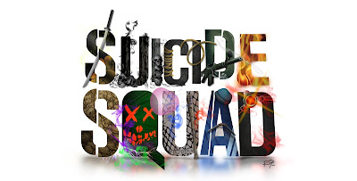
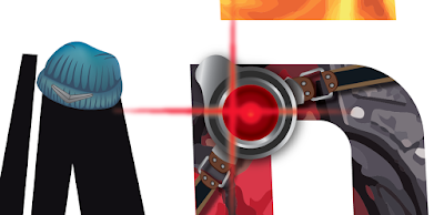
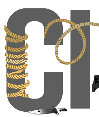
The concept behind this illustration was to work on a visual art without replacing the original Suicide Squad’s typography. I transformed each letter to look and feel each character of the movie. The letter “S” represents Killer Croc; letter “Q” represents the Joker, and; “U” for Harley Quinn.
Credits:
Advertiser: Warner Bros and DC Comics
Advertiser: Warner Bros and DC Comics
Concept Art Director: Marco Zuniga
Graphic Designer: Marco Zuniga
Digital Designer: Marco Zuniga
Creative process:
Thinking:
The idea was built on the foundation of the existing logotype for Suicide Squad. Using the current logotype, I then transformed each letter to be representative of each individual character.
In actualizing the design, I investigated the characters to graphically represent them appropriately in respects to their color, a texture of costume, weapons, and objects used, and finally their ability in action.
The typography used in the background (street) represents each character from the movie and their respective powers in action.
Ideation & Sketching:


 View stream on Flickr
 Mark Zuniga on Blogger
Recent Comments